Visualize data using SAS
This is the third of a series of articles that I will write to give a gentle introduction to statistics. In this article we will cover how we can visualize data using various charts and how to read them. I will show how to create these charts using SAS and will include code snippets as well. For a full version of the code visit my GitHub repository.
SAS has an in-built procedure called sgplot that allows you to create several kinds of plots. Also available is proc univariate which allows you to create histograms and normal probability plots, also known as the QQ plots. In this article we will work with the tips dataset that we also used for our Python demonstration.
Before we start plotting, we need to import the dataset. In SAS we do this using the data step.
proc import datafile='/home/u50248307/data/tips.csv'
     out=tips
     dbms=csv
     replace;
     getnames=yes;
run;
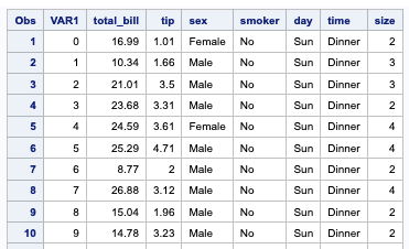
Once we have imported the dataset, we can view it using the proc print statement.
proc print data=tips;
run;
Lets take a quick look at how the tips dataset is structured:
We can further see some summary information on the dataset using proc contents statement.
proc contents data=tips;
run;
You will notice that I am ending all lines with a semicolon. Unlike Python, SAS does not depend on indentation to show scope of statements. Therefore we use the semicolon, just like we do in C++ to signify end of a statement.
Now lets move to visualizing this data. We will cover the following charts in this article:
- Dot plot shows changes between two (or more) points in time or between two (or more) conditions.
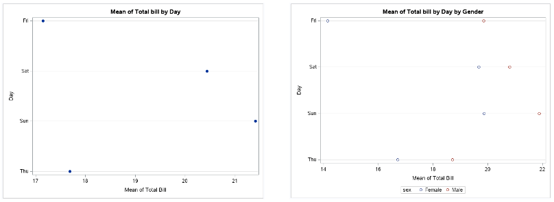
proc sgplot data=tips;
	title 'Mean of Total bill by Day';
	dot day / response=total_bill stat=mean;
	xaxis label='Mean of Total Bill';
	yaxis label='Day';
run;

proc sgplot data=tips;
	title 'Mean of Total bill by Day by Gender';
	dot day / response=total_bill group=sex stat=mean;
	xaxis label='Mean of Total Bill';
	yaxis label='Day';
run;
- Bar (horizontal and vertical) chart is used when you want to show a distribution of data points or perform a comparison of metric values across different subgroups of your data.
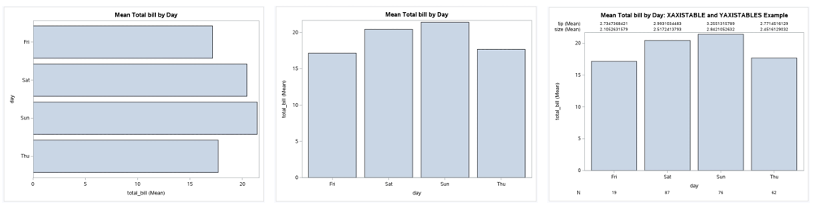
# horizontal bar chart;
proc sgplot data=tips;
	title 'Mean Total bill by Day';
	/*hbar day;*/ /*if no other option is specified then it just shows row frequency by cat variable*/
	hbar day / response=total_bill stat=mean;
	/*hbar day / response=tip stat=mean y2axis;*/
run;

# vertical bar chart;
proc sgplot data=tips;
	title 'Mean Total bill by Day';
	vbar day / response=total_bill stat=mean;
run;

# XAXISTABLE and YAXISTABLES statements create axis tables which display data values at specific locations along an axis. The only required argument is a list of one or more variables to be displayed.;
proc sgplot data=tips;
	title 'Mean Total bill by Day: XAXISTABLE and YAXISTABLES Example';
	vbar day / response=total_bill stat=mean;
	xaxistable tip size / stat=mean position=top;
	xaxistable var1 / stat=freq label="N"; /* the var1 variable was chosen arbitrarily in order to obtain frequency counts of the number of records in each category */
run;
- Stacked Bar char is useful when you want to show more than one categorical variable per bar
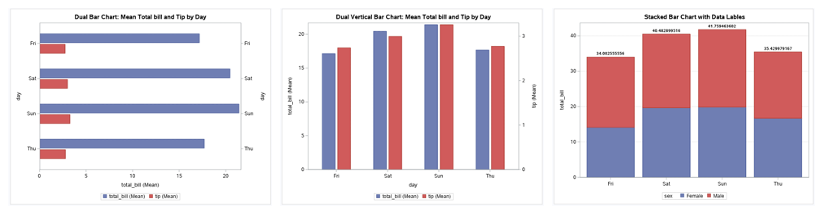
# Offset Dual Horizontal Bar Plot;
proc sgplot data=tips;
	title 'Dual Bar Chart: Mean Total bill and Tip by Day';
	hbar day / response=total_bill stat=mean barwidth=0.25 discreteoffset=-0.15;
	hbar day / response=tip stat=mean  barwidth=0.25 discreteoffset=0.15 y2axis;
run;

# Offset Dual Vertical Bar Plot;
proc sgplot data=tips;
	title 'Dual Vertical Bar Chart: Mean Total bill and Tip by Day';
	vbar day / response=total_bill stat=mean barwidth=0.25 discreteoffset=-0.15;
	vbar day / response=tip stat=mean  barwidth=0.25 discreteoffset=0.15 y2axis;
run;

# Stacked Bar Plot;
proc sgplot data=tips;
  title 'Stacked Bar Chart with Data Lables';
  vbar day / response=total_bill group=sex stat=mean datalabel datalabelattrs=(weight=bold);
  xaxis display=(nolabel);
  yaxis grid  label='total_bill';
run;
- Needle plot is similar to barplot and a scatter plot, it can be used to plot datasets that have too many mutations for a barplot to be meaningful.
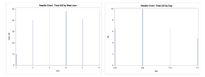
proc sgplot data=tips;
  	title 'Needle Chart: Total bill by Meal size';
	needle x=size y=total_bill ;
run;

proc sgplot data=tips;
  	title 'Needle Chart: Total bill by Day';
	needle x=day y=tip ;
run;
- Boxplot (horizontal and vertical) In a box plot, numerical data is divided into quartiles, and a box is drawn between the first and third quartiles, with an additional line drawn along the second quartile to mark the median. In some box plots, the minimums and maximums outside the first and third quartiles are depicted with lines, which are often called whiskers.
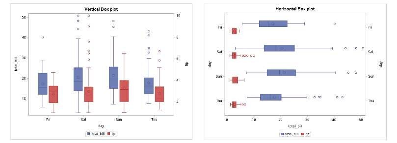
# Vertical Box plot;
proc sgplot data=tips;
	title 'Vertical Box plot';
	vbox total_bill / category=day boxwidth=0.25 discreteoffset=-0.15;
	vbox tip / category=day boxwidth=0.25 discreteoffset=0.15 y2axis;
run;

# Horizontal Box plot;
proc sgplot data=tips;
	title 'Horizontal Box plot';
	hbox total_bill / category=day boxwidth=0.25 discreteoffset=-0.15;
	hbox tip / category=day boxwidth=0.25 discreteoffset=0.15 y2axis;
run;
- Histogram is a visual representation of the frequency distribution of your data. The frequencies are represented by bars.
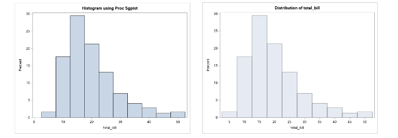
proc sgplot data=tips;
	title'Histogram using Proc Sgplot';
	histogram total_bill;
run;

proc univariate data=tips;
	title'Histogram using Proc Univariate';
	histogram total_bill;
run;
- Probability Plot is a way of visually comparing the data coming from different distributions. It can be of two types - pp plot or qq plot
- pp plot (Probability-to-Probability) is the way to visualize the comparing of cumulative distribution function (CDFs) of the two distributions (empirical and theoretical) against each other.
- qq plot (Quantile-to-Quantile) is used to compare the quantiles of two distributions. The quantiles can be defined as continuous intervals with equal probabilities or dividing the samples between a similar way The distributions may be theoretical or sample distributions from a process, etc.
- Normal probability plot is a case of the qq plot. It is a way of knowing whether the dataset is normally distributed or not
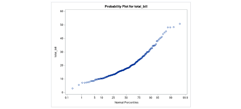
proc univariate data=tips;
	title'Normal probability (QQ) plot using Proc Univariate';
	probplot total_bill;
run;
- Scatter plot shows the relationship between two numerical variables.
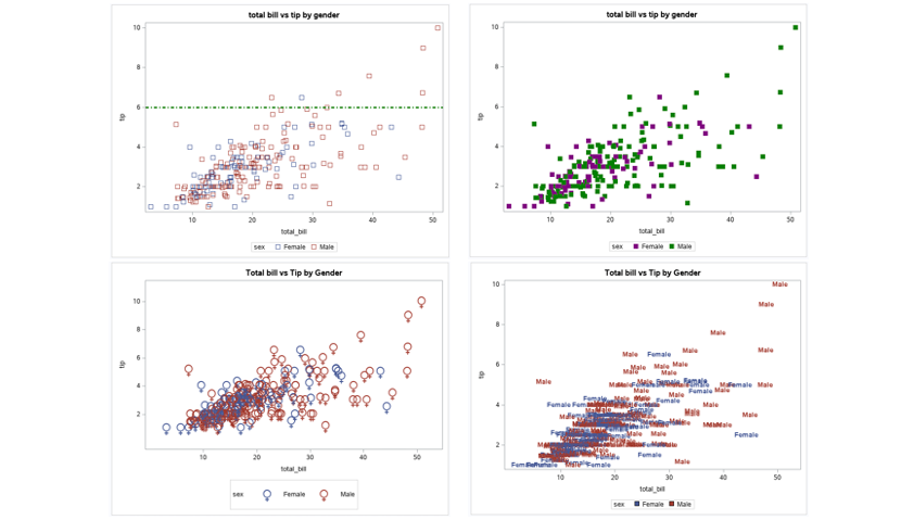
proc sgplot data=tips;
	title "total bill vs tip by gender";
	scatter x=total_bill y=tip / group=sex markerattrs=(symbol=Square size=10px);
	/* SYMBOL: Circle, CircleFilled, Square, Star, Plus, X
	SIZE: 0.2in, 3mm, 10pt, 5px, 25pct
	COLOR: red, blue, lightscreen, aquamarine, CXFFFFFF */
	refline 6 / axis=y lineattrs=(color=green thickness=3px pattern=ShortDashDot); /* REFLINE statement adds horizontal or vertical reference lines to a plot. Its unnamed required argument is a numeric variable, value, or list of values. A reference line will be added for each value listed or for each value of the variable specified. */
run;

# Scatter plot with attribute cycling - when multiple lists of attributes are specified on the STYLEATTRS statement (for example, a list of marker shapes and a list of marker colors);
proc sgplot data=tips;
	title "total bill vs tip by gender";
	styleattrs datasymbols=(SquareFilled CircleFilled) datacontrastcolors=(purple green);
	scatter x=total_bill y=tip / group=sex markerattrs=(size=10px);
	/* SYMBOL: Circle, CircleFilled, Square, Star, Plus, X
	SIZE: 0.2in, 3mm, 10pt, 5px, 25pct
	COLOR: red, blue, lightscreen, aquamarine, CXFFFFFF */
run;

/* SYMBOLCHAR statement is used to define a marker symbol from a Unicode value. */
proc sgplot data=tips;
	title "Total bill vs Tip by Gender";
	scatter x=total_bill y=tip / group=sex markerattrs=(size=40);
	symbolchar name=female_sign char="2640"x; /* identifiers “female_sign” and “male_sign” are arbitrary names */
	symbolchar name=male_sign char="2642"x;
	styleattrs datasymbols=(female_sign male_sign);
run;

/* Using Data as a Symbol Marker */
proc sgplot data=tips;
	title "Total bill vs Tip by Gender";
	scatter x=total_bill y=tip / group=sex markerchar=sex markercharattrs=(weight=bold size=10pt);
run;
- Line plot is used to visualize the value of something over time. VLINE statement is used to create a vertical line chart (which consists of horizontal lines). The endpoints of the line segments are statistics based on a categorical variable as opposed to raw data values.
LOCATION=Specifies whether legend will appear INSIDE or OUTSIDE (default) the axis area. POSITION=Specifies the position of the legend: TOP, BOTTOM (default), LEFT, RIGHT, TOPLEFT, TOPRIGHT, BOTTOMLEFT, BOTTOMRIGHT DOWN=Specifies number of rows in legend ACROSS=Specifies number of columns in legend TITLEATTRS=Specifies text attributes of legend title VALUEATTRS=Specifies text attributes of legend values
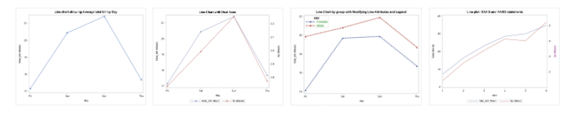
# Basic line plot
proc sgplot data=tips;
	title 'Line chart showing Average total bill by Day';
	vline day / response=total_bill stat=mean markers;
run;

# Line Chart with Dual Axes;
proc sgplot data=tips;
	title 'Line Chart with Dual Axes';
	vline day / response=total_bill stat=mean markers;
	vline day / response=tip stat=mean markers y2axis;
run;

# Line Chart by group with Modifying Line Attributes and Legend;
proc sgplot data=tips;
	title 'Line Chart by group with Modifying Line Attributes and Legend';
	styleattrs datasymbols=(TriangleFilled CircleFilled) datalinepatterns=(ShortDash LongDash);
	vline day / response=total_bill stat=mean markers group=sex lineattrs=(thickness=4px);
	keylegend / location=inside position=topleft across=1 titleattrs=(weight=bold size=12pt) valueattrs=(color=green size=12pt);
run;

# XAXIS and YAXIS statements are used to control the features and structure of the X and Y axes, respectively;
proc sgplot data=tips;
	title 'Line plot: XAXIS and YAXIS statements';
	vline size / response=total_bill stat=mean;
	vline size / response=tip stat=mean y2axis;
   	yaxis min=0 max=40 minor minorcount=9 valueattrs=(style=italic) label='Total Bill ($)';
   	y2axis offsetmin=0.1 offsetmax=0.1 labelattrs=(color=purple);
	/* offsets are proportional to axis length, so between 0 and 1 */
run;
The best way to get better at visualization is through practice. What I have found useful is participating in a weekly visualization challenge called the TidyTuesday!
Comments welcome!