30 Day Daily Chart Challenge
During the month of April 2021, I participated in the #30DayMapChallenge, a daily social data project hosted by Cédric Scherer, Maya Gans and Dominic Royé. In this blog post I wanted to briefly talk about the project and share my experience, learnings in terms of data and tools used, and challenges faced. However, before I delve into that, here is a collage of my submissions.
HD Version: 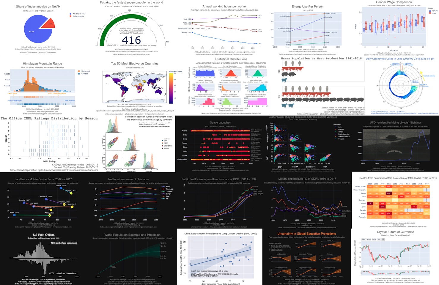
The ask
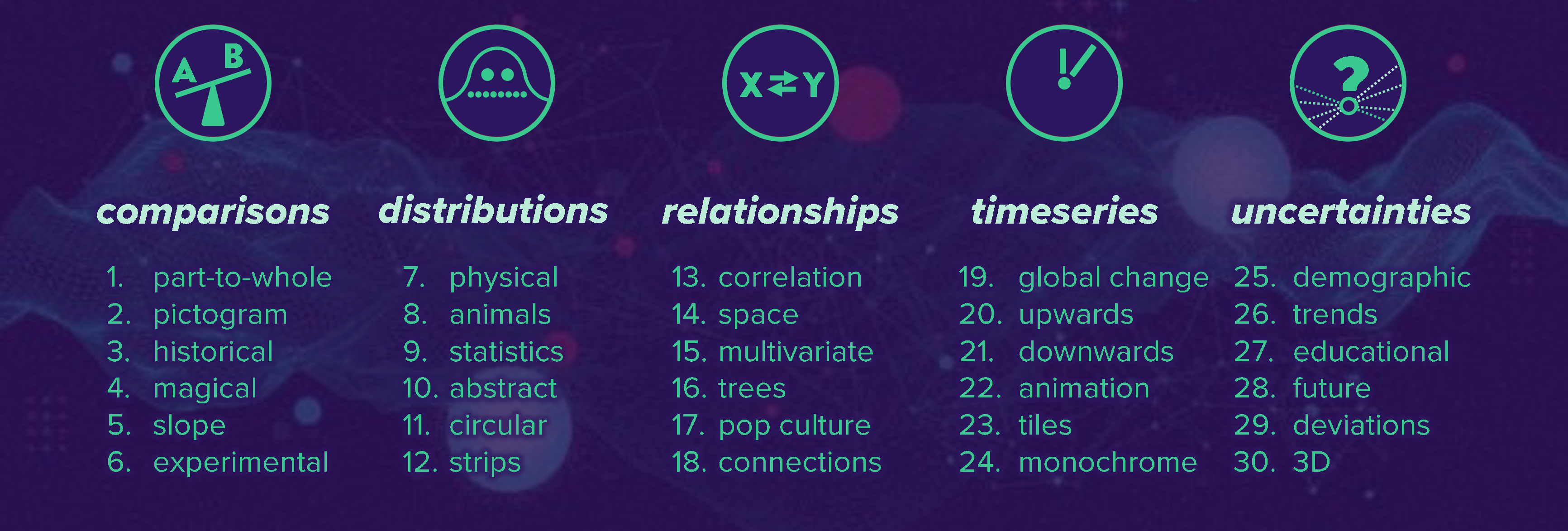
The project was about plotting a chart a day using any tool and any relevant dataset. Each day had a different theme and there were five main themes and then sub-themes within them as shown below. For example for day 1 part-to-whole comparison, one could plot the number of Indian Netflix viewers out of the total number of Netflix viewers across the world. For day 15 multivariate relationships, one could plot the relationship between technology indicators and stock market performance.
Tools used
I mainly used Python for plotting. There were several visualization libraries that I used such as Plotly, Altair, Seaborn, Matplotlib, and pandas.plot. I wanted to use Bokeh and plotnine for later some submissions but did not have time alongside my job so ended up reusing some of the code from initial submissions. Overall, I found that Plotly was best for customization while Seaborn and Altair let you create some neat charts very quickly.
Additionally, one of the most useful library that I worked with was dataprep. This is a fast and easy exploratory data analysis tool that allows one to understand a Pandas/Dask DataFrame with a few lines of code in seconds. I was able to quickly slice and dice data in a visual manner using the create_report function, thus enabling me to quickly decide if a particular dataset was relevant for the topic of the day. Following is a code snippet of how one can do that.
from dataprep.datasets import load_dataset
from dataprep.eda import create_report
df = load_dataset("titanic")
create_report(df).show_browser()
Few of my submissions
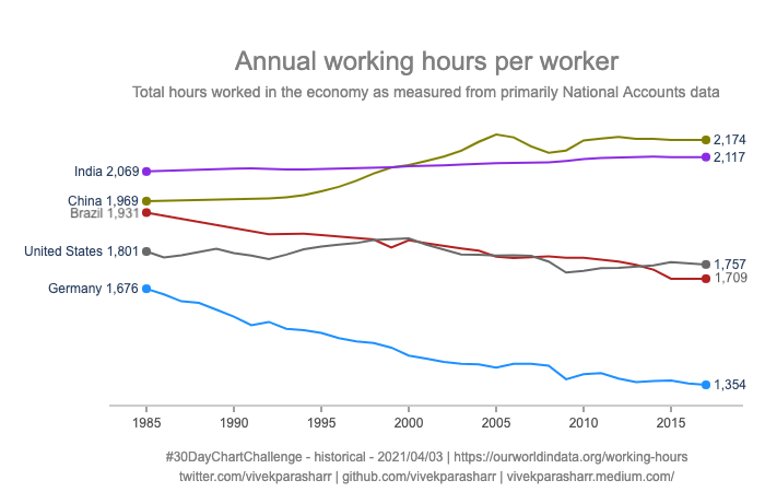
For day 3, I found an interesting dataset on OWID about the number of working hours. In general the working hours in most countries have gone down over time with a few exceptions. Used Plotly to create a line chart that shows this. The y-axis shows Average working hours per worker over a full year. Used a for loop to add each line to the plot with a separate color.
for i in range(0, y_axis_levels):
    fig.add_trace(go.Scatter(x=x_data[i], y=y_data[i], mode='lines',
        name=y_axis_labels[i],
        line=dict(color=colors[i], width=line_size[i]),
        connectgaps=True,
    ))
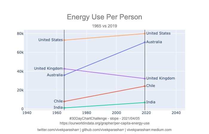
For day 5, I found an interesting dataset on OWID about the energy use per person by country. In general the energy use has been increasing dramatically with some of the most developed countries with the highest energy used per capita. Tried to capture this across time using a slope chart plotted using Plotly. Used for loop to plot separate lines for each country and added separate lines to reflect time.
# lines by country
for x_val, y_val, cat_val in zip(year1val, year2val, cat1val):
    fig.add_trace(go.Scatter(x=[year1, year2], y=[x_val, y_val], mode='lines+markers+text', text=[cat_val, cat_val], textposition=['middle left', 'middle right'] ))
# vertical lines representing time
fig.add_shape(type="line", x0=year1, y0=vp_min, x1=year1, y1=vp_max,line=dict(color="Grey",width=2))
fig.add_shape(type="line", x0=year2, y0=vp_min, x1=year2, y1=vp_max,line=dict(color="Grey",width=2))
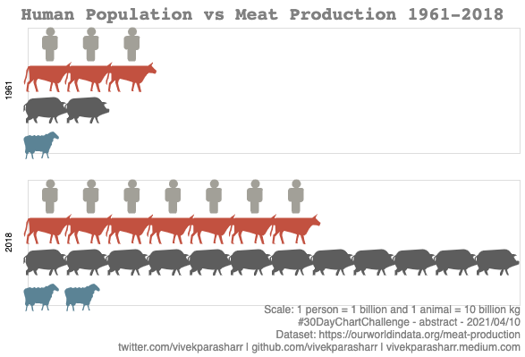
For day 10, I focused on showing the meat consumption trend using Altair. The library makes it really simple to plot shapes on a chart. Following is partial code and the output.
chart = alt.Chart(source).mark_point(filled=True, opacity=1, size=100).encode(
    alt.X('x:O', axis=None),
    alt.Y('animal:O', axis=None),
    alt.Row('year:N', header=alt.Header(title='')),
    alt.Shape('animal:N', legend=None, scale=shape_scale),
    alt.Color('animal:N', legend=None, scale=color_scale),
)
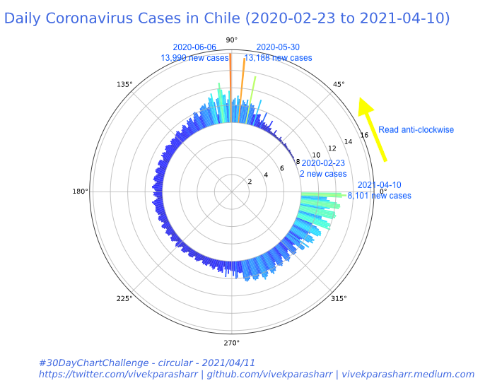
For day 11, I decided to just plot the number of cases of COVID-19 that happened over a period of 1 year in Chile. Used Matplotlib to plot this. Following is partial code and the output.
angles0 = np.random.normal(loc=0, scale=1, size=10000)
angles1 = np.random.uniform(0, 2*np.pi, size=1000)

# Construct figure and axis to plot on
fig, ax = plt.subplots(1, 2, subplot_kw=dict(projection='polar'))

# Visualise by area of bins
circular_hist(ax[0], angles0)
# Visualise by radius of bins
circular_hist(ax[1], angles1, offset=np.pi/2, density=False)
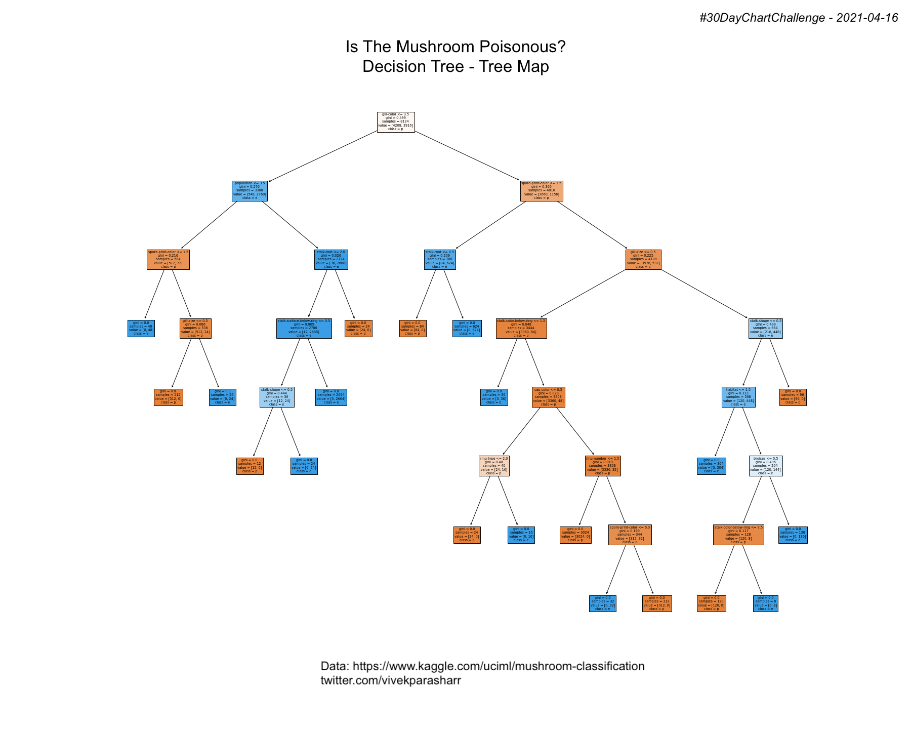
Day 16 was about trees, so decided to use the Kaggle dataset on mushrooms and ran a decision tree model with default values for the parameters to classify a mushroom as poisonous or not, and built a tree map.
# Fit the classifier with default hyper-parameters
clf = DecisionTreeClassifier(random_state=1234)
model = clf.fit(X, y)

# Print Text Representation
text_representation = tree.export_text(clf)
print(text_representation)

# Plot Tree with plot_tree
fig = plt.figure(figsize=(25,20), facecolor='white')
_ = tree.plot_tree(clf,
                   feature_names=feature_names1,
                   class_names=df['class'].unique(),
                   filled=True)
fig.savefig("decistion_tree.png")
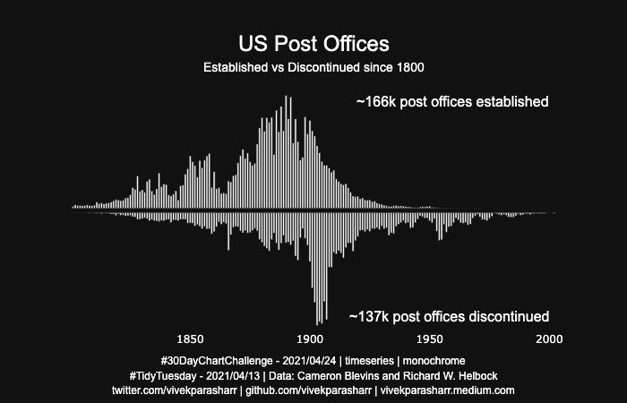
Day 24 was limiting in the way that you could only plot a monochrome chart. Found the interesting dataset on US post offices which showed how many post offices were established and disconnected by year. Plotted the established count on +y and discontinued on the -y axis.
from plotly.subplots import make_subplots
import plotly.graph_objects as go
fig = make_subplots(rows=2, cols=1,
    shared_xaxes=True, vertical_spacing=0.02,)
    #subplot_titles=("Plot 1", "Plot 2"))
fig.add_trace(
    go.Bar(x=list(e.established), y=list(e.state), name='Established', marker_color=chosen_color),
        #text=list(m['hex']),textposition='auto'),
    row=1, col=1
)
fig.add_trace(
    go.Bar(x=list(d.discontinued), y=list(d.state2), name='Discontinued', marker_color=chosen_color),
        #text=list(m['hex']),textposition='auto'),
    row=2, col=1
)
The challenge
The biggest challenge was certainly in finding the right data for the kind of chart to be plotted on a particular day. Following are some of the websites that I used for getting the data data.world, kaggle, TidyTuesday, MakeoverMonday, Eurostats, UN Stats, WHO, and OECD Stats.
For complete version of the code snapshots shown in this blog visit my GitHub.
Comments welcome!