Maps
Following are some of the maps that I created as part of the 30DayMapChallenge!
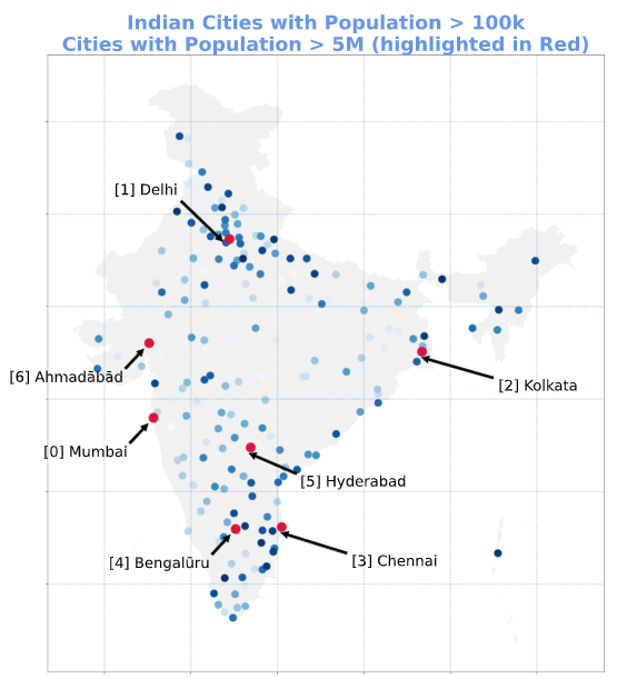
#30DayMapChallenge - Day 1 - Points.
India has ~40 cities with more than a million people, ~400 cities with between 100,000 and 1 million people, and ~2500 cities with between 10,000 and 100,000 people.
Created with Python/matplotlib.
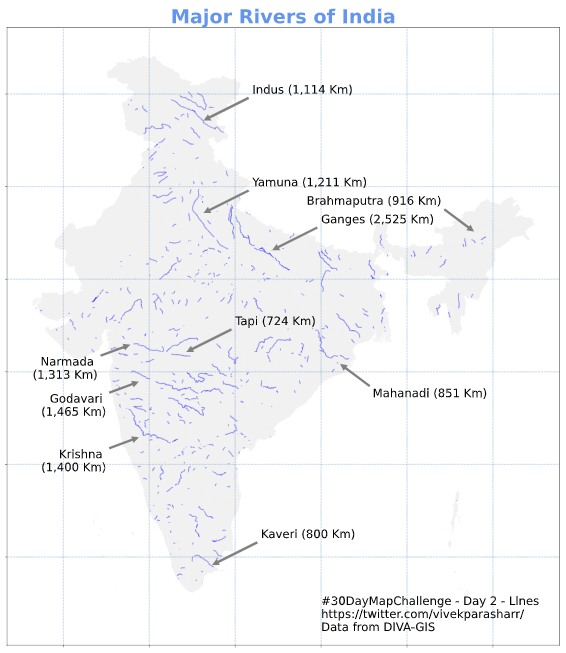
#30DayMapChallenge - Day 2 - Lines
Seven major rivers and their numerous tributaries make up the river system in India. Ganga is the largest river in India. Over 5,000 Himalayan glaciers feed these rivers.
Created #python + #matplotlib
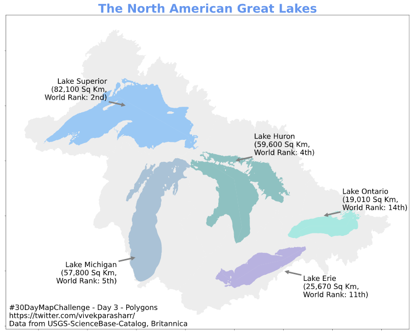
#30DayMapChallenge - Day 3 - Polygons
Great Lakes are a chain of deep freshwater lakes in North America. They rank among the 14 largest lakes in the world. The #GreatLakesInitiative strives to protect aquatic life, wildlife, and human health.
Created with #Python + #MatPlotLib
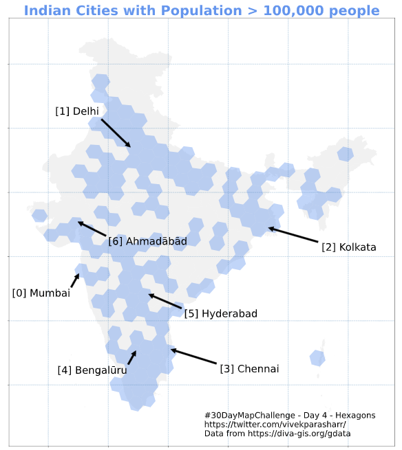
#30DayMapChallenge - Day 4 - Hexagons
Recycled my map from day 1. Used H3 library to layer in a hexagon grid and convert point lat/lng to H3 grid id for the point at level 3 (grid size of approximately 100km).
Created using #Python + #MatPlotLib + #UberH3
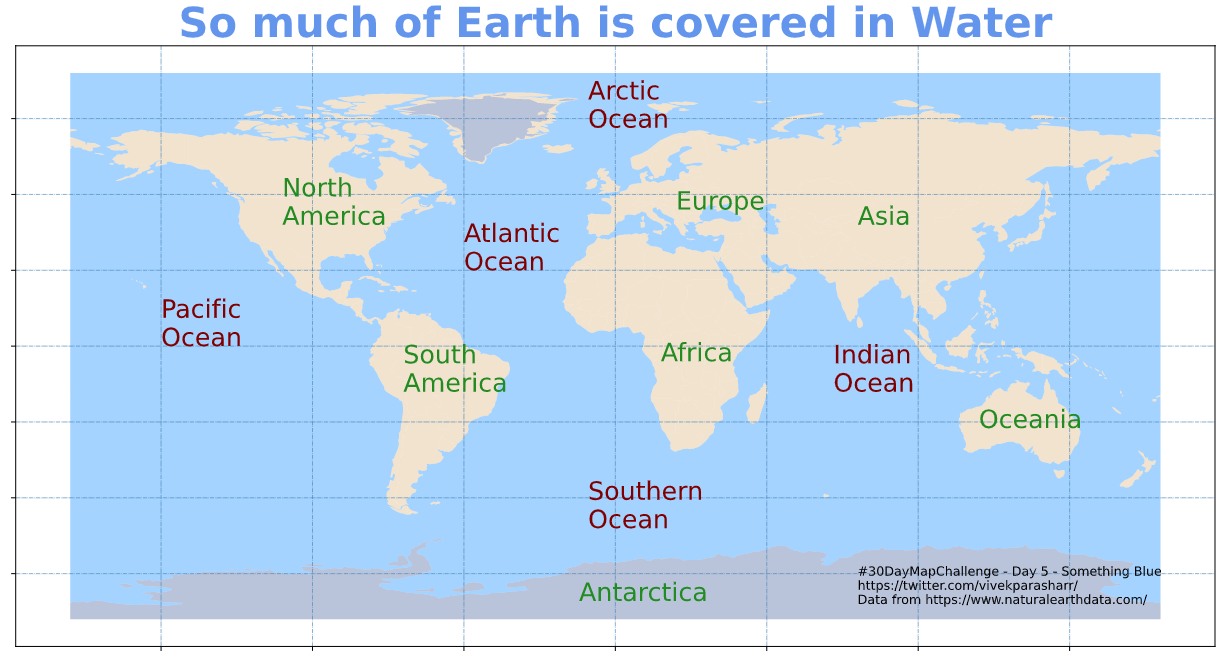
#30DayMapChallenge - Day 5 - Something Blue
About 71% of the Earth’s surface is covered with water (oceans: 96.5%, fresh water: 3%, drinkable water: 0.5%). That’s why it’s so important to #conservewater.
Created using #Python + #MatPlotLib
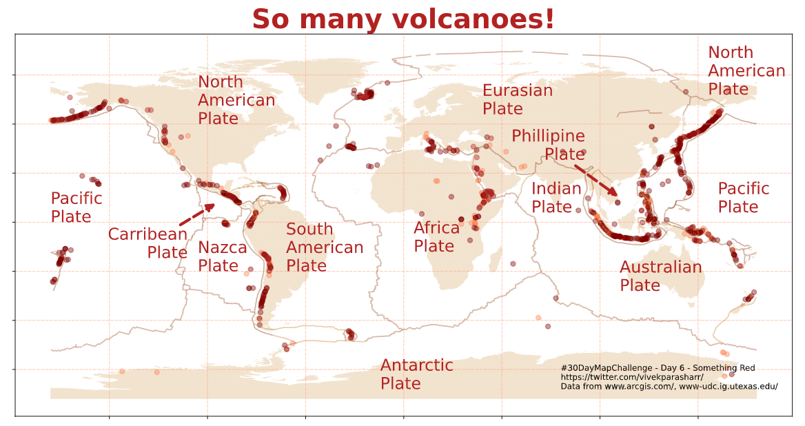
#30DayMapChallenge - Day 6 - Red
World’s 75% active volcanoes are around the ring of fire, a horseshoe-shaped zone that stretches from the southern tip of S.America across the W.Coast of N.America, through the Bering Sea to Japan, and on to NZ.
Created using #Python+#MatPlotLib
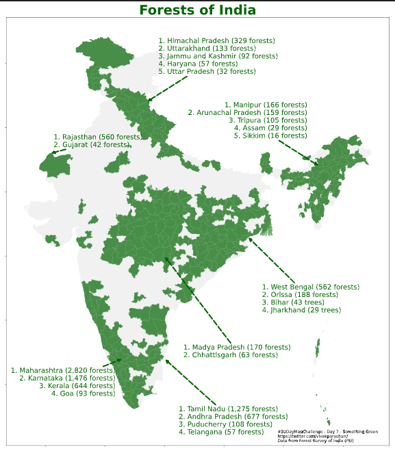
#30DayMapChallenge - Day 7 - Something Green
India has over 10,500 forests spread across an area of over 700,000 Sq. Km. Southern and Eastern parts of India have a noticeably higher concentration of forests.
Created using #Python + #MatPlotLib
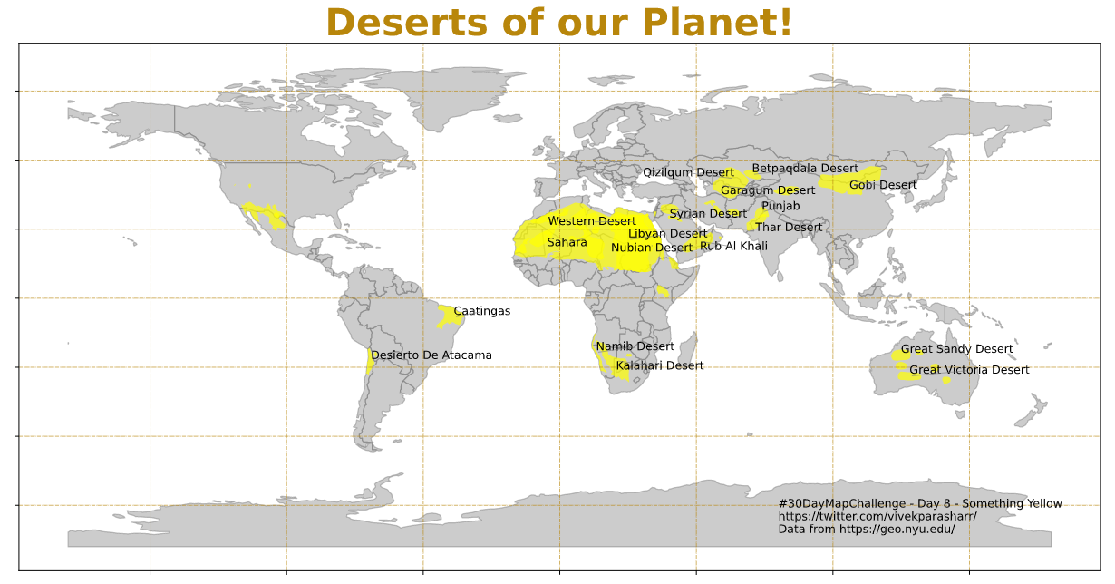
#30DayMapChallenge - Day 8 - Yellow
Hot deserts are growing in size due to climate change/deforestation. Sahara (largest) has grown by 10% since 1920. Atacama is the driest/oldest, dinosaur eggs were discovered in Gobi, Thar is the most populated.
Created with #Python+#matplotlib
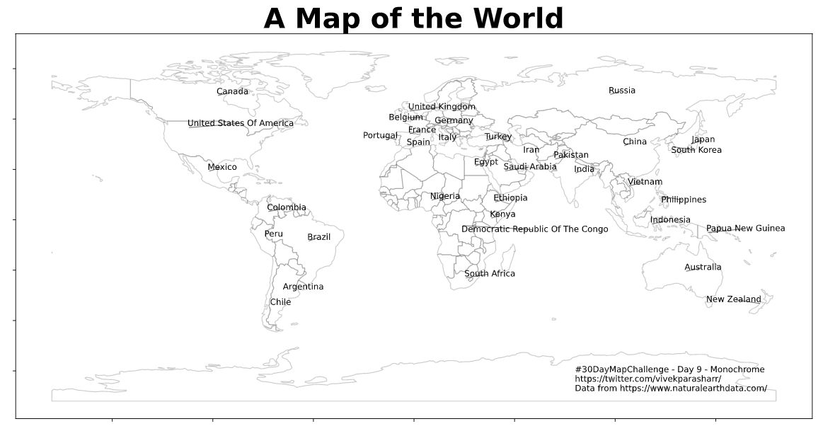
#30DayMapChallenge - Day 9 - Monochrome
Lazy submission! A black and white map of the world. Used a library for easy labelling called adjustText.
Created using #Python + #matplotlib
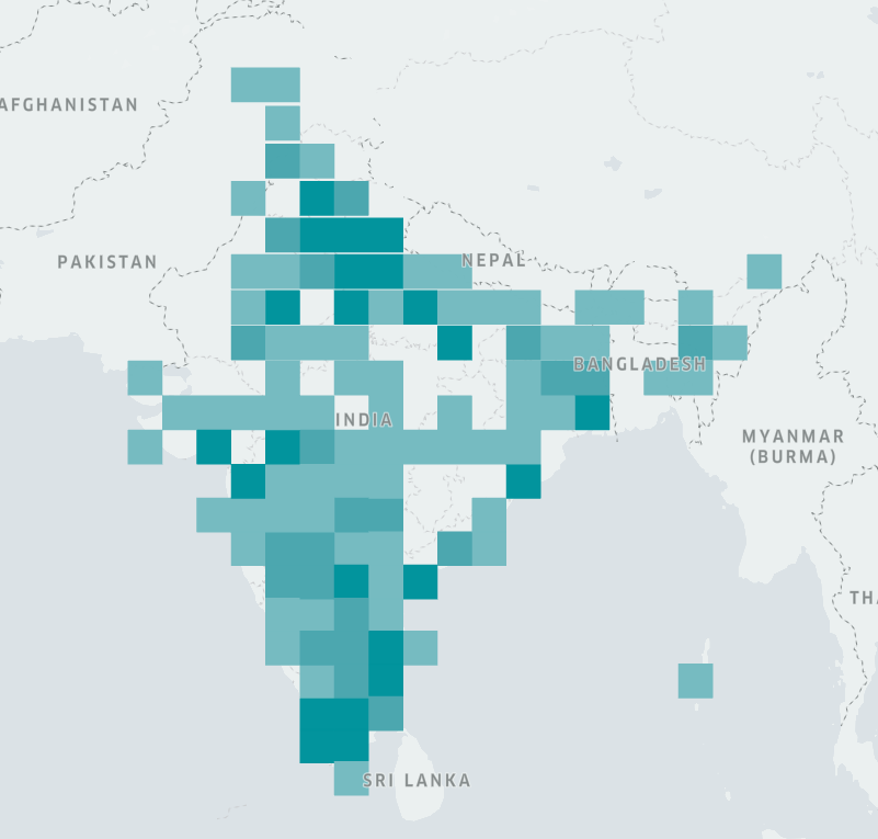
#30DayMapChallenge - Day 10 - Grid
Reusing data from day 1. Instead of plotting the cities as points, mapped cities to a square grid. Each grid is 150x150 Sq. Km., and its color is representative of number of cities with population > 100k in it.
Created using #Python + #Kepler.gl
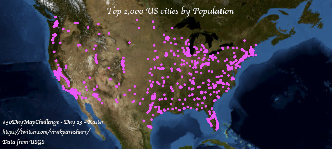
#30DayMapChallenge - Day 13 - Raster
Used #python + #plotly to plot a map of the US and mark the top 998 cities by population. Wanted to zoom in on the mainland, so excluded Anchorage (Alaska) and Honolulu (Hawaii) even though they are in the list.
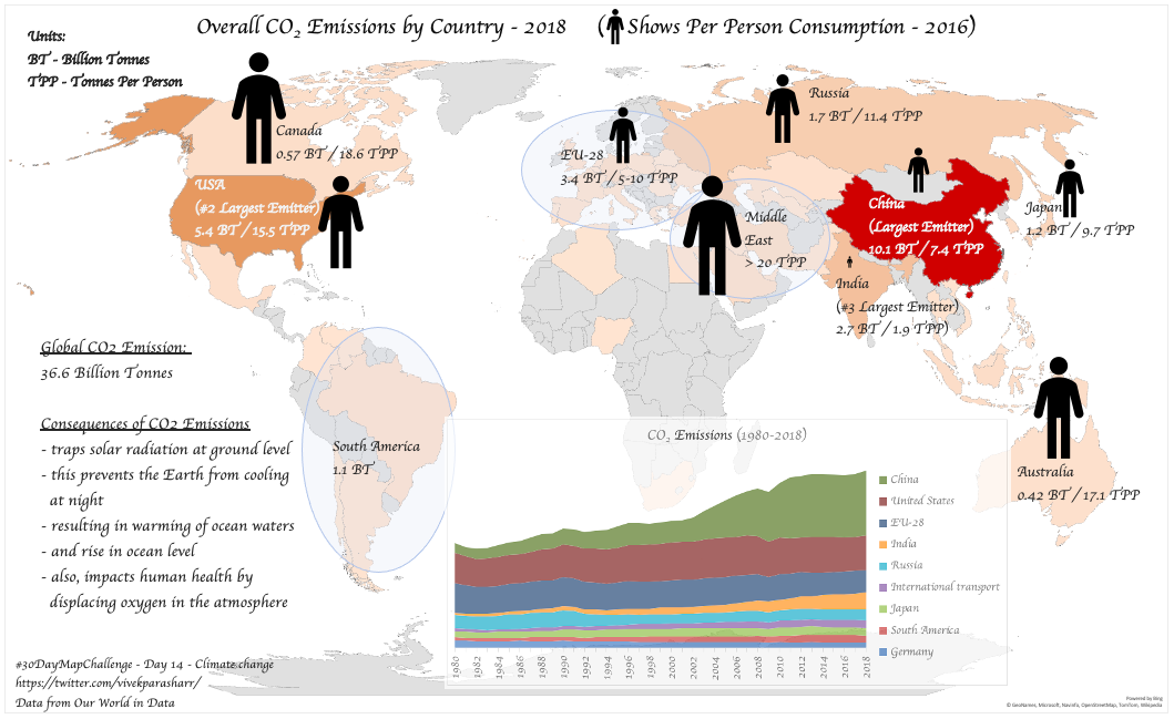
#30DayMapChallenge - Day 14 - Climate change
Carbon Dioxide traps solar radiation at ground level which prevents the Earth from cooling at night, resulting in warming of ocean waters and rise in ocean level. Data from @OurWorldInData and @Worldometers
Created using Excel.
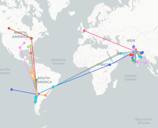
#30DayMapChallenge - Day 15 - Connections
Halfway through seems like I will make it to the end. A map showing travels!
Created using #python + the amazing #plotly
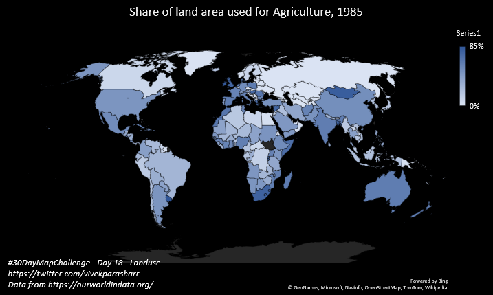
#30DayMapChallenge - Day 18 - Landuse
Maps showing evolution of share of land area used for agriculture between 1985 and 2005.
Data from @OurWorldInData
Created using Microsoft Excel.
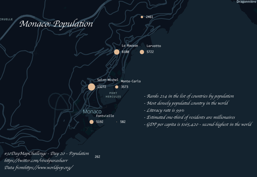
#30DayMapChallenge - Day 20 - Population
Somehow we always focus on the most populated countries, so thought to shift the focus and look at one of the least populated. Plotted a map showing population spread of Monaco.
Created using #python + #keplergl
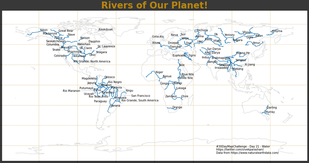
#30DayMapChallenge - Day 21 - Water
A map showing rivers of our planet. Rivers longer than a 1,000 Km are named.
Created using #Python + #MatPlotLib
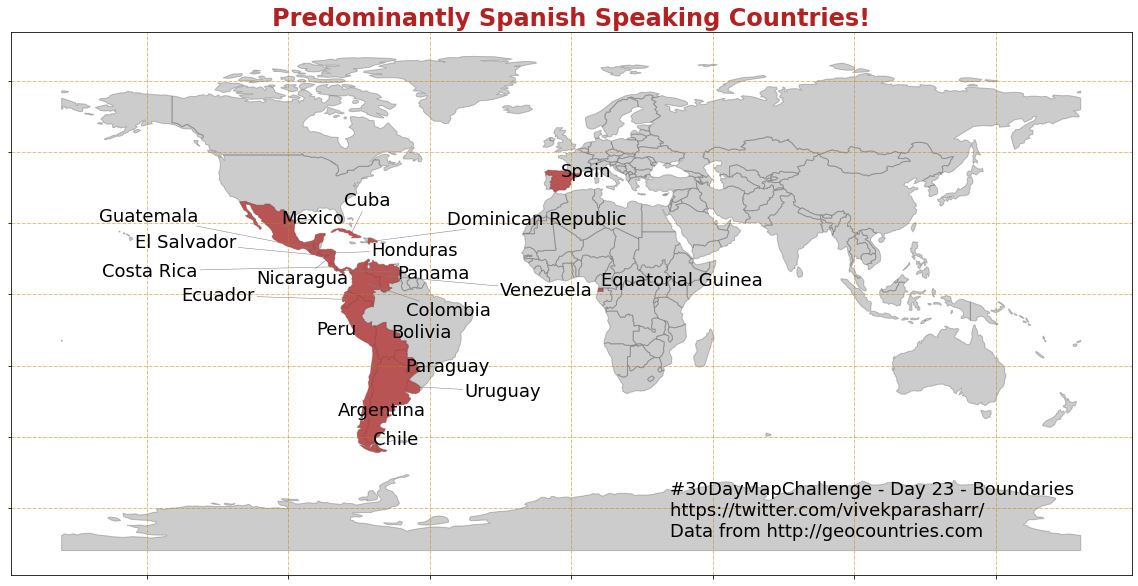
#30DayMapChallenge - Day 23 - Boundaries
Language could also be a boundary for some! A world map showing country boundaries, highlighting predominantly Spanish speaking countries.
Created using #Python + #MatPlotLib + #pycountry
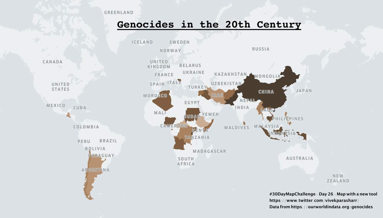
#30DayMapChallenge - Day 26 - Map with a new tool
Found an interesting dataset on genocides in the 20th century. Darker the shade, more the number of people killed. Source: https://t.co/Bfop1qD5Jx
Created using #python + #keplergl + #gimp
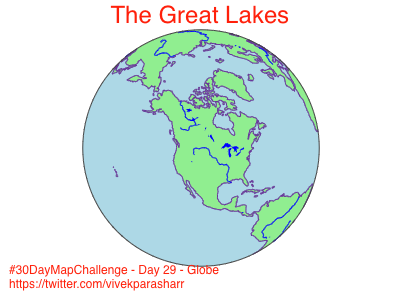
#30DayMapChallenge - Day 29 - Globe
Another view of the Great Lakes submission from day 3.
Created using #Python + #MatPlotLib
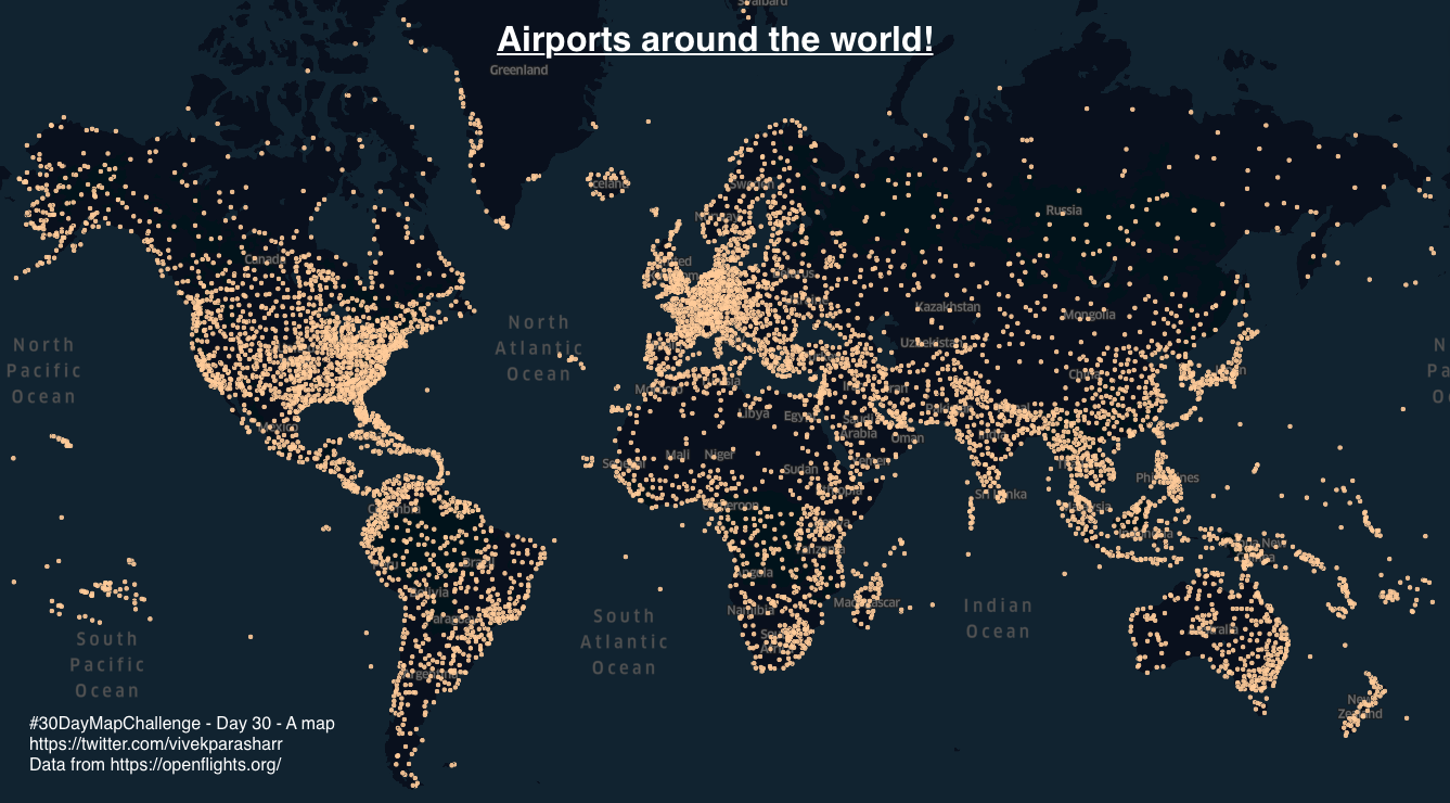
#30DayMapChallenge - Day 30 - A map
Just a map showing all the airports in the world for the last day!
Code for all submissions here - https://t.co/m0MeKvHTt9
Created using #Python + #keplergl