Charts
Following are some of the charts that I created as part of the 30DayChartChallenge!
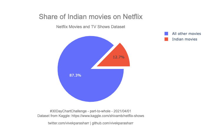
#30DayChartChallenge - Day 1 - part-to-whole
A pie chart showing the number of Indian movies vs movies from rest of the world on Netflix. Dataset from @kaggle
Code: https://t.co/xGJTzzXwR7
#Python + #MatPlotLib
#30DayChartChallenge - Day 2 - pictogram
Fugaku, the worlds fastest supercomputer far outperforms previous #1 Summit.
Source: https://t.co/zW2IrmSVpO
Code: https://t.co/xGJTzzXwR7
#Python + #MatPlotLib

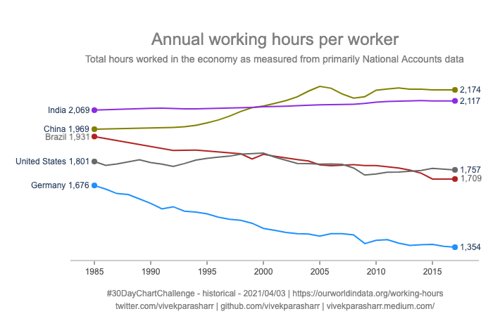
#30DayChartChallenge - Day 3 - historical
The chart shows Average working hours per worker over a full year.
Source: https://t.co/rjDSiJmGQ0
Code: https://t.co/xGJTzzXwR7
#Python + #MatPlotLib
#30DayChartChallenge - Day 4 - magical
A word cloud of the Harry Potter and the Philosopher’s Stone book.
Code: https://t.co/xGJTzzXwR7
#Python + #MatPlotLib

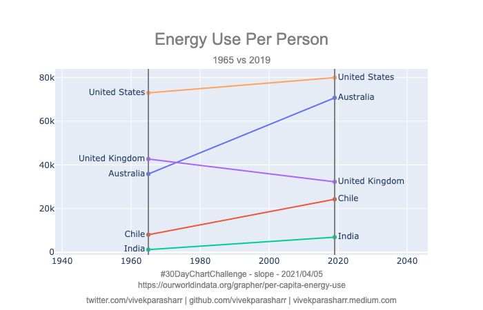
#30DayChartChallenge - Day 5 - slope
Energy use per person from select countries from different continents!
Code: https://t.co/xGJTzzXwR7
#Python + #MatPlotLib
#30DayChartChallenge - Day 6 - experimental
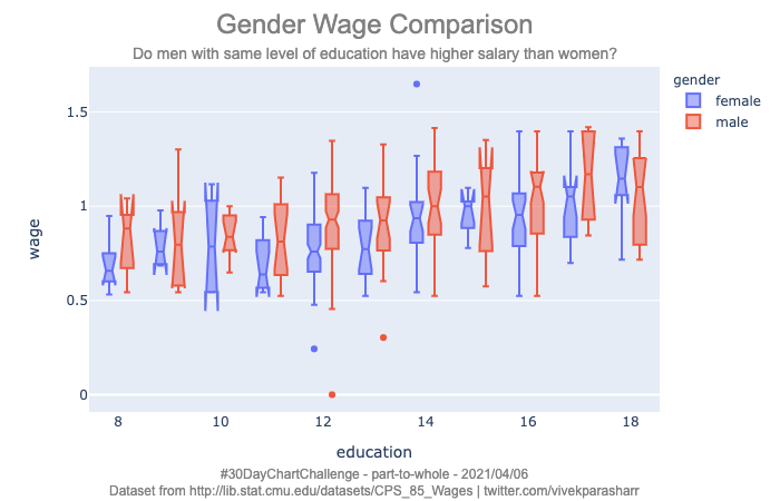
Do men with same level of education have higher salary than women?
Code: https://t.co/xGJTzzXwR7
Dataset: https://t.co/NoE9LGCX1Q
#Python + #MatPlotLib
#30DayChartChallenge - Day 7 - physical
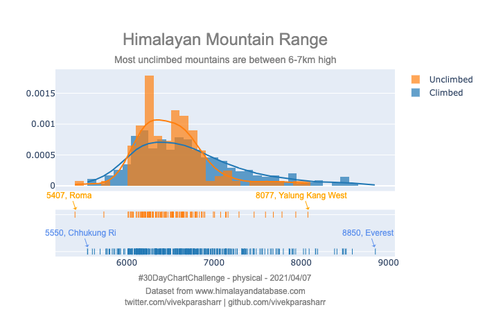
Most unclimbed mountains in the Himalayan mountain range are between 6-7km high.
Code: https://t.co/xGJTzzXwR7
Dataset: https://t.co/eAKD1s1XTq
#Python + #MatPlotLib
#30DayChartChallenge - Day 8 - animals
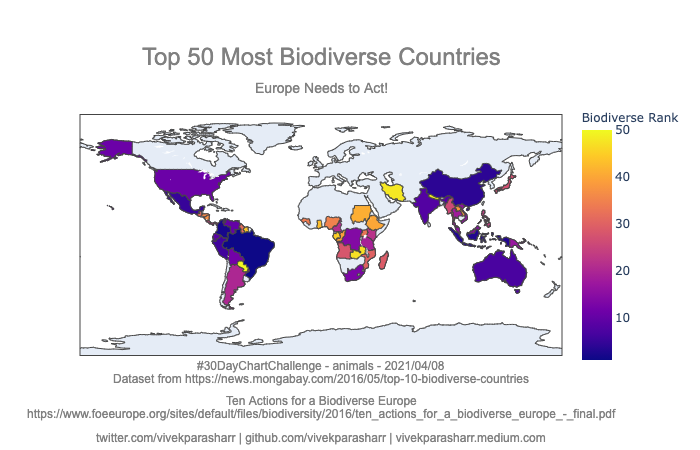
A map showing top 50 most biodiverse countries, none of which are in Europe.
This 2016 report lists ten steps EU can take: https://t.co/hcFw0LvQPA
Code: https://t.co/xGJTzzXwR7
Dataset: https://t.co/mijGNJgpXW
#Python + #MatPlotLib
#30DayChartChallenge - Day 9 - statistical
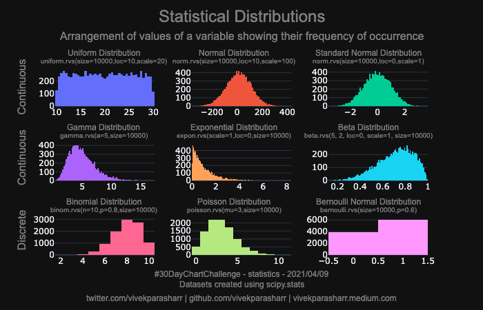
Thought of plotting common statistical distributions in one chart for reference. Also wrote an article few months ago about this: https://t.co/eyUsUc8kyO
Code: https://t.co/xGJTzzXwR7
#Python + #MatPlotLib
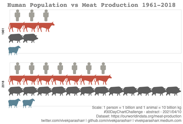
#30DayChartChallenge - Day 10 - abstract
The amount of meat we produce has gone up considerably compared to our population in the last 60 years!
Code: https://t.co/xGJTzzXwR7
#Python + #Altair
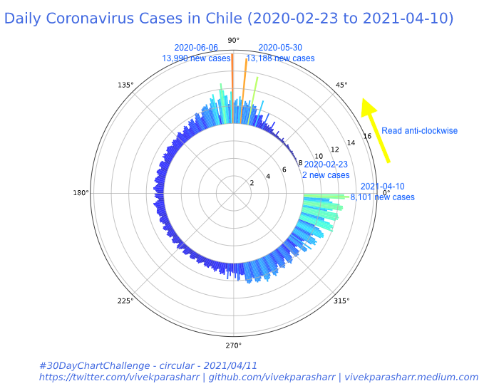
#30DayChartChallenge - Day 11 - circular
Daily new cases of coronavirus in Chile from 2020-02-23 to 2021-04-10.
Code: https://t.co/xGJTzzXwR7
#Python + #MatPlotLib
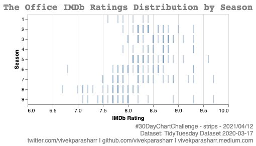
#30DayChartChallenge - Day 12 - strips
Strip plot to show the distribution of IMDb ratings of each episode of The Office by season. Towards the final seasons the ratings seem to be lower perhaps due to Michael’s departure.
Code: https://t.co/xGJTzzFVsx
#Python + #Altair
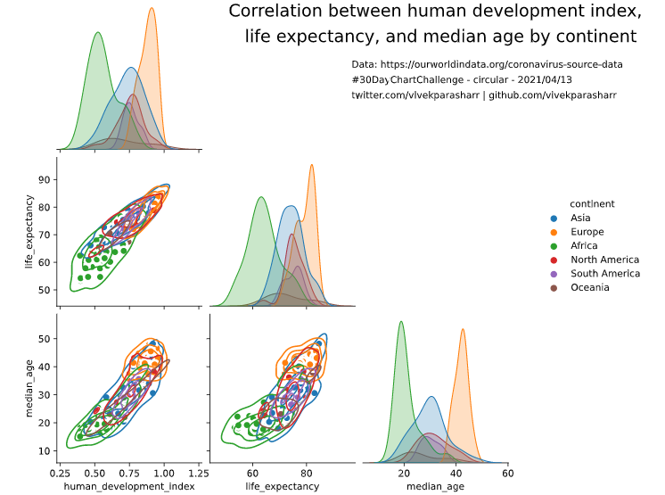
#30DayChartChallenge - Day 13 - correlation
Plot showing correlation between human development index, life expectancy, and median age by continent.
Data: https://t.co/3yjWGSt8s3
Code: https://t.co/xGJTzzXwR7
#Python + #Seaborn
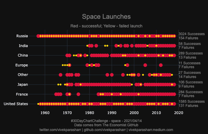
#30DayChartChallenge - Day 14 - space
Plot showing each year there was a space launch and whether there were successful or failed launches by country!
Data comes from The Economist GitHub
Code: https://t.co/xGJTzzXwR7
#Python + #Plotly
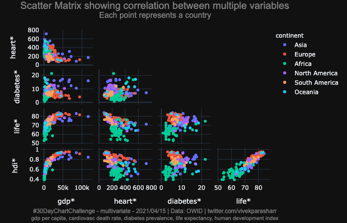
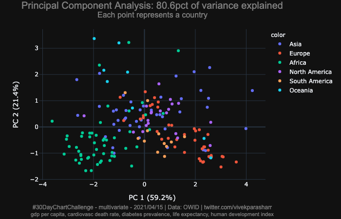
#30DayChartChallenge - Day 15 - multivariate
Extracted few features of countries from OWID COVID dataset. Plotted a scatter matrix of the features and 2-D scatter plots showing PCA and LDA output.
Data comes from OWID
Code: https://t.co/xGJTzzXwR7
#Python + #Plotly
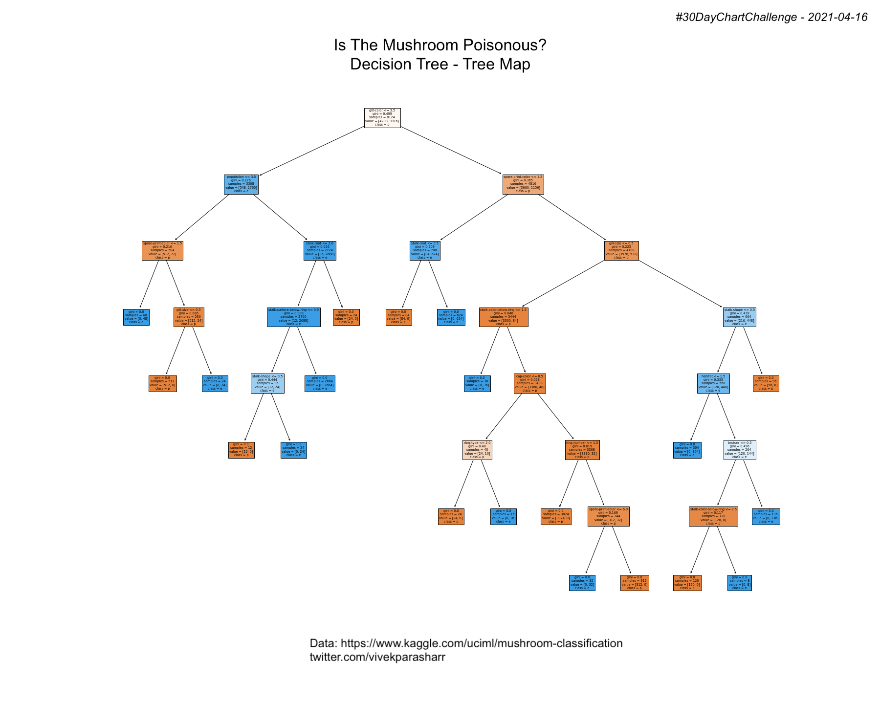
#30DayChartChallenge - Day 16 - trees
Ran a decision tree model with default values for the parameters and built a tree map.
Data comes from https://t.co/PUCI5Y63OV
Code: https://t.co/xGJTzzXwR7
#Python + #sklearn + #MatPlotLib
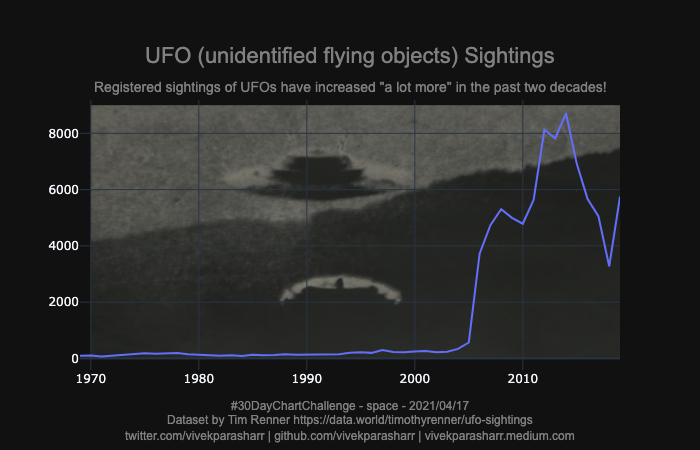
#30DayChartChallenge - Day 17 - pop culture
Registered sightings of UFOs have increased “a lot more” in the past two decades!
Dataset by Tim Renner https://t.co/oqmX0yZcIw
Code: https://t.co/xGJTzzFVsx
#Python + #Plotly
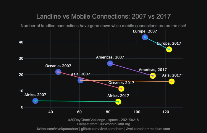
#30DayChartChallenge - Day 18 - connections
As expected, the number of landline connections have gone down while mobile connections are on the rise.
Dataset from @OurWorldInData
Code: https://t.co/xGJTzzFVsx
#Python + #Plotly
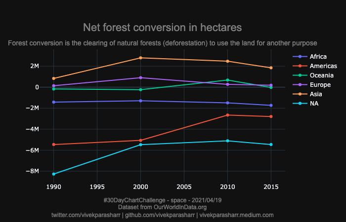
#30DayChartChallenge - Day 19 - connections
#TidyTuesday - 2021-04-06 - Deforestation
A plot showing Net forest conversion in hectares between 1995 and 2015.
Dataset from @OurWorldInData
Code: https://t.co/xGJTzzFVsx
#Python + #Plotly
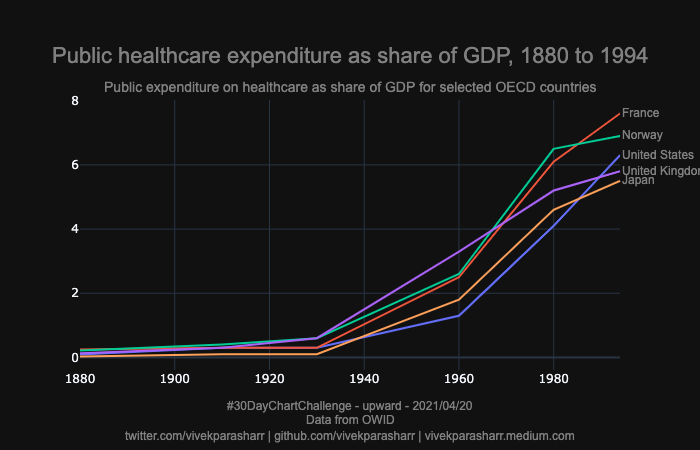
#30DayChartChallenge - Day 20 - upward
Rising share of healthcare expenditure in GDP.
Dataset from @OurWorldInData
Code: https://t.co/xGJTzzXwR7
#Python + #Plotly
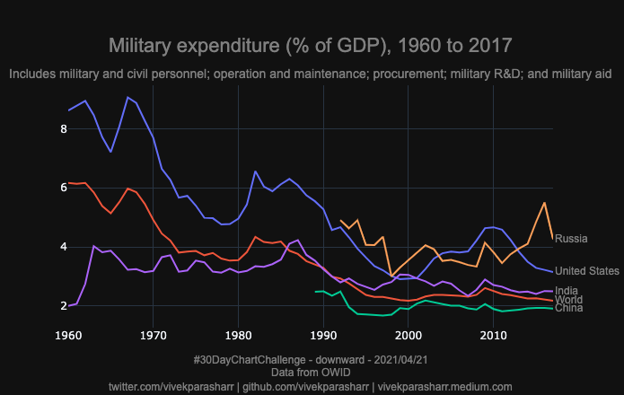
#30DayChartChallenge - Day 21 - downwards
Downward trend in military expenditure (as a share of GDP).
Dataset from @OurWorldInData
Code: https://t.co/xGJTzzXwR7
#Python + #Plotly
#30DayChartChallenge - Day 22 - animated
Chart showing share of adults that are overweight or obese, 1975 to 2016.
Dataset from @OurWorldInData
Code: https://t.co/xGJTzzXwR7
#Python + #MatPlotLib
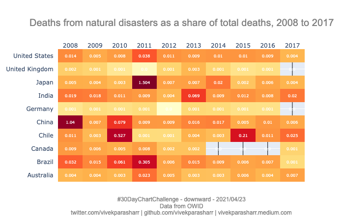
#30DayChartChallenge - Day 23 - tiles
Chart showing deaths from natural disasters as a share of total deaths, 2008 to 2017.
Dataset from @OurWorldInData
Code: https://t.co/xGJTzzXwR7
#Python + #MatPlotLib
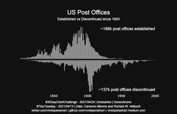
#30DayChartChallenge - Day 24 - monochrome
#TidyTuesday - 2021-03-13
US Post Offices Established vs Discontinued since 1800.
Dataset from Cameron Blevins and Richard W. Helbock
Code: https://t.co/xGJTzzXwR7
Alternate version: https://twitter.com/charliegallaghr/status/1386139718291709953?s=21
#Python + #MatPlotLib
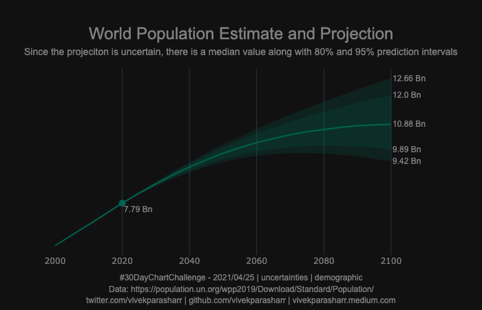
#30DayChartChallenge - Day 25 - demographic uncertainties
World population estimate and predictions + 95%/80% confidence intervals.
Dataset from @unpublications
Code: https://t.co/xGJTzzFVsx
#Python + #MatPlotLib
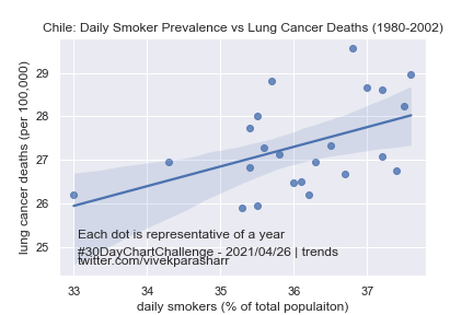
#30DayChartChallenge - Day 26 - uncertainties - trends
plotting an ols trendline between daily smoker prevalence and lung cancer deaths in Chile between 1980-2002 along with 95% ci.
Dataset from @OurWorldInData
Code: https://t.co/xGJTzzXwR7
#Python + #Seaborn
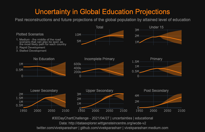
#30DayChartChallenge - Day 27 - uncertainties - educational
Plot showing past reconstructions and future projections of the global population by attained level of education.
Dataset from Wittgenstein Centre
Code: https://t.co/xGJTzzXwR7
#Python + #Plotly
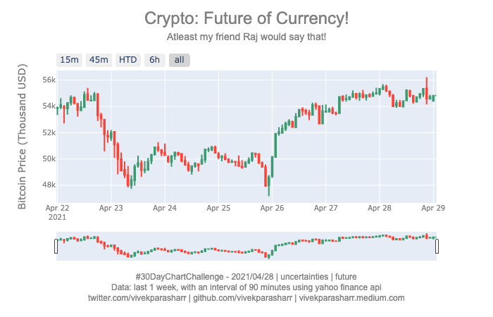
#30DayChartChallenge - Day 28 - uncertainties - future
Candlestick plot showing open/close/high/low price of BTC (future of currency) for last 1 week at a 90 minute interval.
Dataset: yahoo finance api
Code: https://t.co/xGJTzzXwR7
#Python + #Plotly
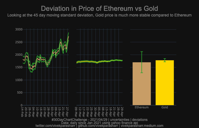
#30DayChartChallenge - Day 29 - uncertainties - deviations
Looking at the 45 day moving standard deviation, Gold price is much more stable compared to Ethereum.
Dataset from yahoo finance api
Code: https://t.co/xGJTzzFVsx
#Python + #Plotly
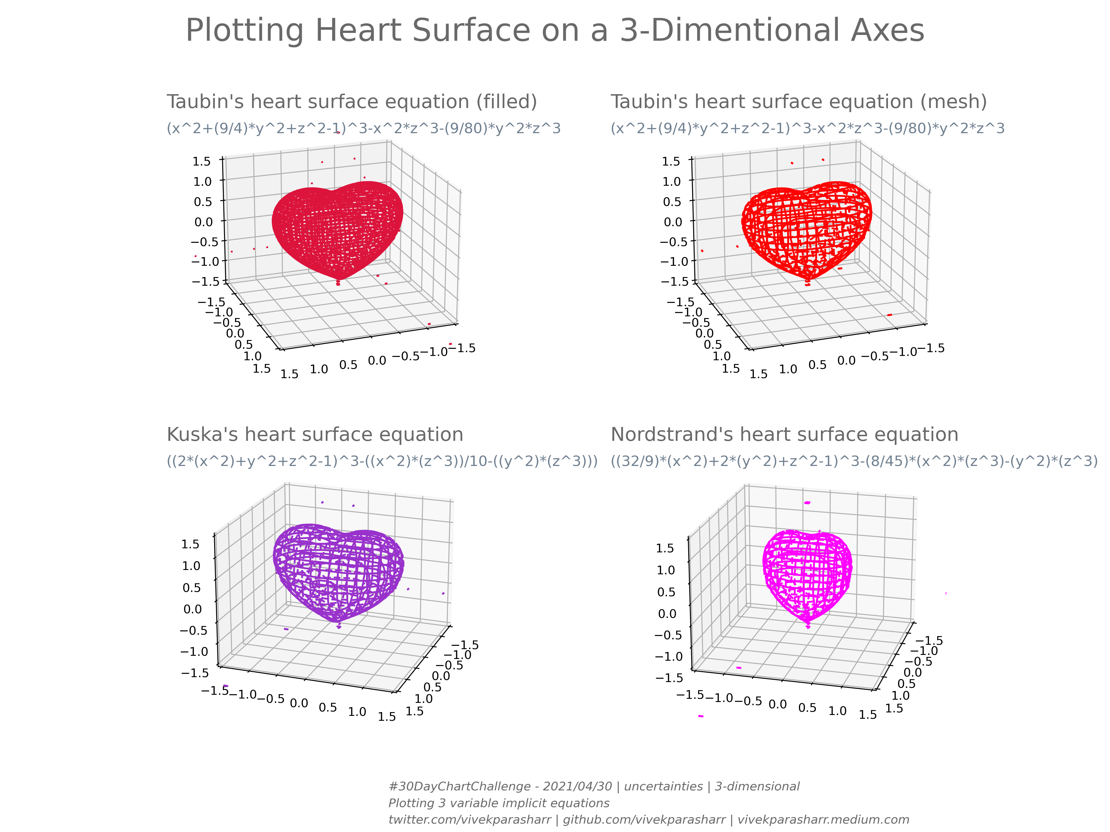
#30DayChartChallenge - Day 30 - 3-dimentional
For my wife @Alejand86069918, for helping me take out some time everyday to participate.
Code: https://t.co/xGJTzzXwR7
#Python + #MatPlotLib